User:NikosA: Difference between revisions
Jump to navigation
Jump to search
m (added alternative grass-gis logo) |
m (Added categories) |
||
| Line 69: | Line 69: | ||
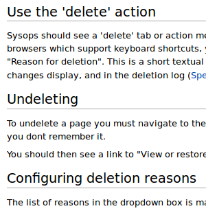
* [http://grasswiki.osgeo.org/wiki/File:Grasswiki_distance_between_sections.png GRASS-Wiki, distance between Sections] | * [http://grasswiki.osgeo.org/wiki/File:Grasswiki_distance_between_sections.png GRASS-Wiki, distance between Sections] | ||
* [http://grasswiki.osgeo.org/wiki/File:Mediawiki_distance_between_sections.png Media-Wiki, distance between Sections] | * [http://grasswiki.osgeo.org/wiki/File:Mediawiki_distance_between_sections.png Media-Wiki, distance between Sections] | ||
[[Category: Ideas]] | |||
[[Category: Logo]] | |||
[[Category: Typography]] | |||
[[Category: Colors]] | |||
Revision as of 09:14, 6 January 2013
Nikos Alexandris
Other userpages
Contact
nik at nikosalexandris dot net
Scratching ideas for the GRASS-wiki
GRASS-GIS logo
 |
GRASS-Wiki native colors
Should GRASS-Wiki pages wear GRASS' native colors?
Or else... ?
Some random example: light grey font-color (#dcdcdc), green border (#4da948)
Also,
- style the tab-bar to approach the grass-gis website?
Better typography
Review and possibly alter:
- move ToC on the right, make it fixed!
- linespacing (between hierarchy elements!)
- indentation of code blocks -- might improve readability
- (non-code) text wrapping -- narrower body text column, easier to read
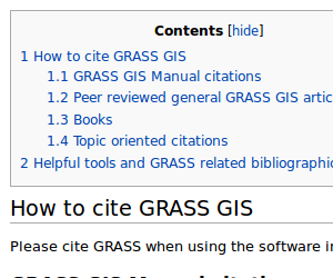
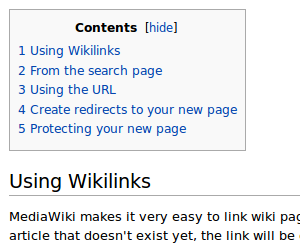
Distance between ToC and 1st Section
Match Media-Wiki's bigger distance from ToC to 1st Section!
 |
 |
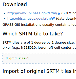
Distance between Sections
Seems to be the same, for some reason, anyhow, some lengthy GRASS-pages look overfilled/noisy!
 |
 |
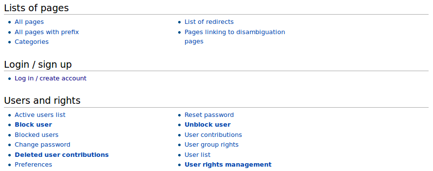
The GRASS-Wiki Special Pages are nicely structured, easy to read. Is there, and what exactly, a formatting difference with the "dafault" GRASS-Wiki pages?
