User:NikosA: Difference between revisions
m (First impressions of a custom css designed by archi.tect.gr) |
|||
| Line 13: | Line 13: | ||
Various ideas discussed with <http://archi.tect.gr/> | Various ideas discussed with <http://archi.tect.gr/> | ||
Testing will take place on: | Testing will take place on ('''...not sure! :-?'''): | ||
* http://grasswiki.osgeo.org/wiki/User:NikosA/common.css | * http://grasswiki.osgeo.org/wiki/User:NikosA/common.css | ||
* http://grasswiki.osgeo.org/wiki/User:NikosA/monobook.css | * http://grasswiki.osgeo.org/wiki/User:NikosA/monobook.css | ||
=== GRASS-GIS logo === | === GRASS-GIS logo === | ||
Revision as of 01:22, 16 January 2013
Nikos Alexandris
Other userpages
Contact
nik at nikosalexandris dot net
Scratching ideas for the GRASS-wiki
Various ideas discussed with <http://archi.tect.gr/>
Testing will take place on (...not sure! :-?):
- http://grasswiki.osgeo.org/wiki/User:NikosA/common.css
- http://grasswiki.osgeo.org/wiki/User:NikosA/monobook.css
GRASS-GIS logo
 |
GRASS-Wiki native colors
Should GRASS-Wiki pages wear GRASS' native colors?
Or else... ?
Some random example: light grey font-color (#dcdcdc), green border (#4da948)
Also,
- style the tab-bar to approach the grass-gis website?
Better typography
Review and possibly alter:
- move ToC on the right, make it fixed! This will "save" some long pages!
- linespacing (between hierarchy elements!)
- indentation of code blocks -- might improve readability
- (non-code) text wrapping -- narrower body text column, easier to read
Some proof-of-clean-typography screenshots
First impressions of a custom css designed by <http://archi.tect.gr/>
The very left column is like a Wiki's connection terminal -- it should look and act like that for the user. It should also clearly state GRASS-GIS' identity.
 |
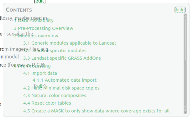
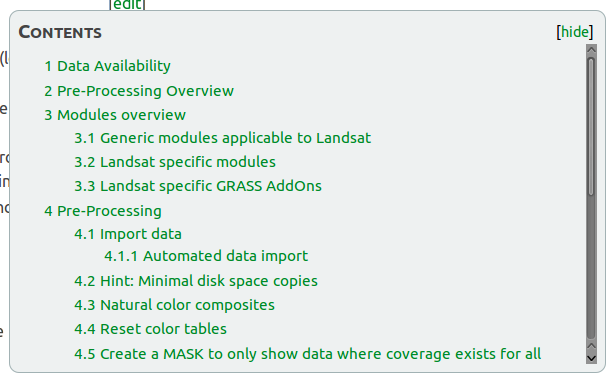
Better typography is not only about aesthetics. It's about readability and making things easier to study. The screenshot below speaks for itself. Hint: the ToC is always accessible, following the user's eyes!
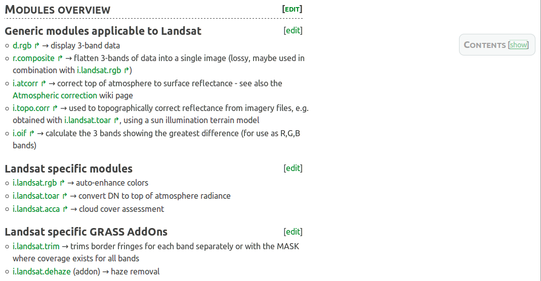
The Table of Contents is a must have for page-content organisation and navigation. Can it be *always* accessible while not distracting the user from reading when not required? Yes, it can.
 |
 |
The Categories bar, finally can receive the attention it deserves!

Related sources:
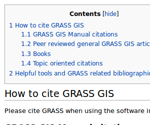
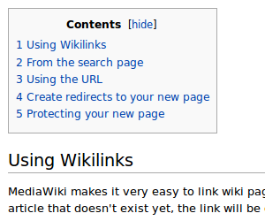
Distance between ToC and 1st Section
Match Media-Wiki's bigger distance from ToC to 1st Section!
 |
 |
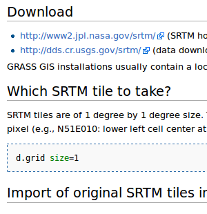
Distance between Sections
Seems to be the same, for some reason, anyhow, some lengthy GRASS-pages look overfilled/noisy!
 |
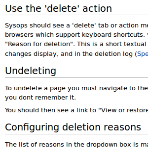 |
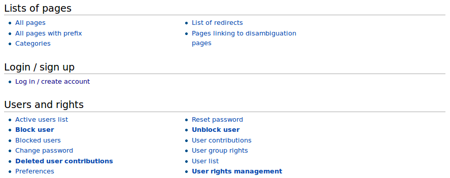
The GRASS-Wiki Special Pages are nicely structured, easy to read. Is there, and what exactly, a formatting difference with the "dafault" GRASS-Wiki pages?
