Identity
The need of a visual identity
GRASS is still lacking a relevant, well tempered graphical identity. Some proposals are being discussed especially to design a new splash screen (and welcome banner). The full thread is there.
This page is intended to initiate a place where tests and suggestions could be gathered.
Logotype
Graphics
GRASS official logo is a great starting point, as it has been here for ...ever? Given the original vector file is somewhat irregular (twisted diamond, doubled vertices in grass, overlapping shapes) a cleaned light version is proposed.
For consistency, it is important to use this logo as is, i.e. not being tempted to distort it by any trick (shadows, bump mapping, blur, differential rescaling,...).
Itemisation should be limited to:
- black (and grayscale) version;
- white version, in case it should appear over a dark background/image.
Tagline
The historical one was : «The world's leading open source GIS». Several slogans were recently proposed:
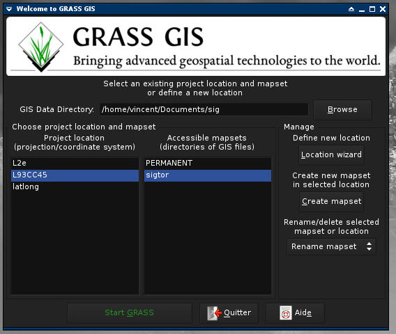
- «Bringing advanced geospatial technologies to the world»;
- «Advanced geospatial technology for everyone»;
- «Opening advanced geospatial technologies to the world».
- ...
Colors
A grass green...
The basic green color is defined as follows:
 - 0,144,0 (rgb);
 - 100,100,44 (cmyk);
 - #009000 (html).
aplha channel is set to 1 (no transparency)
...and a grayscale tone
When required, a grayscale transposition is applied to green:
- either it is an opaque grey:
 - 144,144,144 (rgb);
 - 0,0,0,44 (cmyk);
 - #909090 (html),
- or it is multiplied over background, with alpha transparency:
 - 0,0,0,111 (rgba);
 - 0,0,0,100,44 (cmyk);
 - #0000006f (html).
The white version may as well be declined in opaque or transparent, then green is replaced with translucent white:
 - 255,255,255,111 (rgba);
 - 0,0,0,0,44 (cmyk);
 - #ffffff6f (html).
Typo
The logo can come with text. It uses two fonts. Add your suggestions...
Main font
GRASS GIS name, capitalized. Composed in Fontin regular, with a slightly negative approach. This font is designed by Jos Buivenga, and is free.
Secondary font
This typeface is used to display additional text, such as a motto or tagline. It is composed in EB Garamond, a font designed by Georg Duffner, inspired by the famous historical typeface drawn hundreds of years ago by Claude Garamond. It is freely available, under the terms of the SIL Open Fonts License (ofl).
Applications
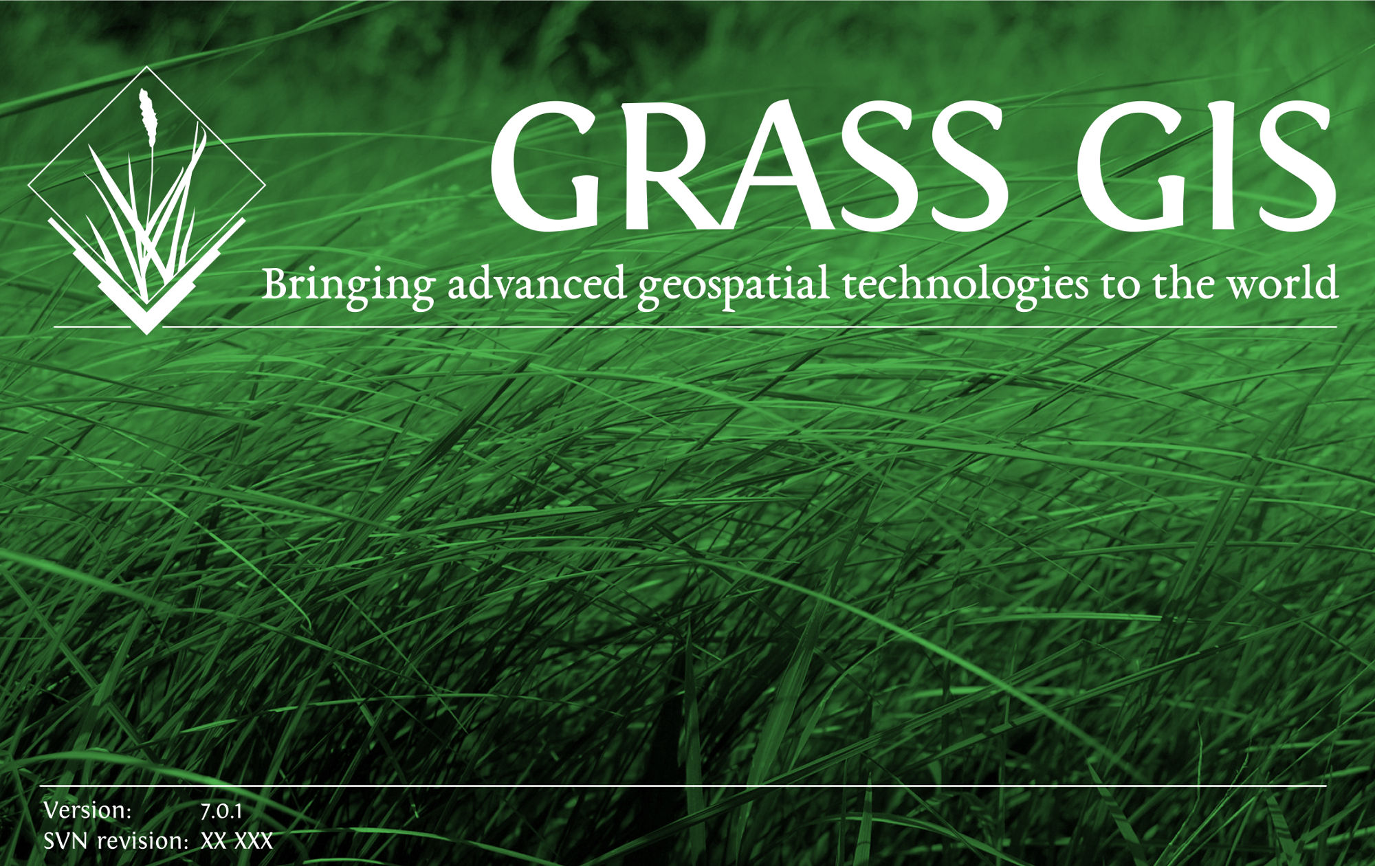
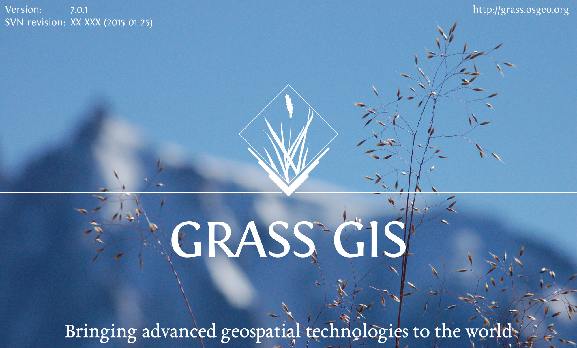
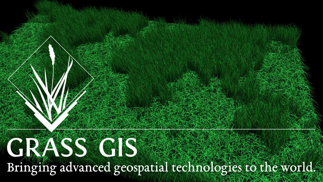
GRASS GIS Splash screen
Objective
Please refer to this thread
Proposals
Here are several tests, feel free to add yours of course.

GRASS GIS Welcome banner
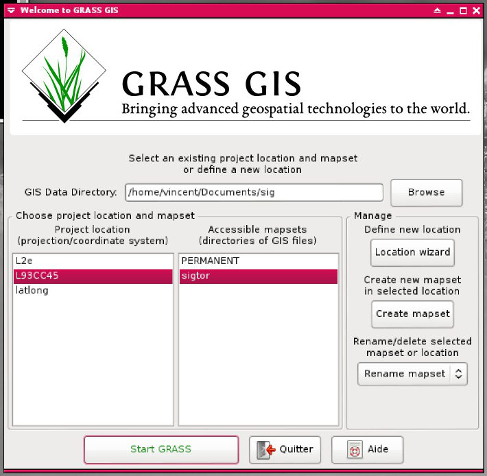
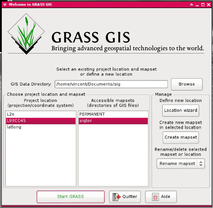
The welcome banner is the image displayed on top of the Welcome frame that pops up when launching GRASS. This image, if present, should be coherent with the graphic design.
Proposals
What next ?
add your suggestions...