Identity
The need of a visual identity
GRASS is still lacking a relevant, well tempered graphical identity. Some proposals are being discussed especially to design a new splash screen (and welcome banner). The full thread is there.
This page is intended to initiate a place where tests and suggestions could be gathered.
Logotype
Graphics
GRASS official logo is a great starting point, as it has been here for ...ever? Given the original vector file is somewhat irregular (twisted diamond, doubled vertices in grass, overlapping shapes) a cleaned light version is proposed.
- Background info: the logo was redigitized by MN in 1998 from a raster master.
For consistency, it is important to use this logo as is, i.e. not being tempted to distort it by any trick (shadows, bump mapping, blur, differential rescaling,...).
Itemisation should be limited to:
- black (and grayscale) version;
- white version, in case it should appear over a dark background/image.

Tagline
The historical one was : «The world's leading open source GIS». Several slogans were recently proposed:
- «Bringing advanced geospatial technologies to the world»;
- «Advanced geospatial technology for everyone»;
- «Opening advanced geospatial technologies to the world».
- ...
Colors
A grass green...
The basic green color is defined as follows:
 - 0,144,0 (rgb);
 - 100,100,44 (cmyk);
 - #009000 (html).
aplha channel is set to 1 (no transparency)
...and a grayscale tone
When required, a grayscale transposition is applied to green:
- either it is an opaque grey:
 - 144,144,144 (rgb);
 - 0,0,0,44 (cmyk);
 - #909090 (html),
- or it is multiplied over background, with alpha transparency:
 - 0,0,0,111 (rgba);
 - 0,0,0,100,44 (cmyk);
 - #0000006f (html).
The white version may as well be declined in opaque or transparent, then green is replaced with translucent white:
 - 255,255,255,111 (rgba);
 - 0,0,0,0,44 (cmyk);
 - #ffffff6f (html).
Typo
The logo can come with text. It uses two fonts. To comply with GRASS GIS license these must be open source fonts.
Main font
GRASS GIS name, capitalized or not. Composed either in Fira Sans, or in Alegreya Sans. It makes sense to confront a modern sans serif typeface, preferably rather light, to a very classical Garamond. Changing GRASS GIS to lowercase is discussed, my opinion is GRASS initials usage turned them into an acronym (we pronounce it), which does not need to be full-capitalized, except the first letter.
Secondary font
This typeface is used to display additional text, such as a motto or tagline. It is composed in EB Garamond, a font designed by Georg Duffner, inspired by the famous historical typeface drawn hundreds of years ago by Claude Garamond. It is freely available, under the terms of the SIL Open Fonts License (ofl).
Applications
GRASS GIS Splash screen
Objective
Please refer to this thread
Proposals
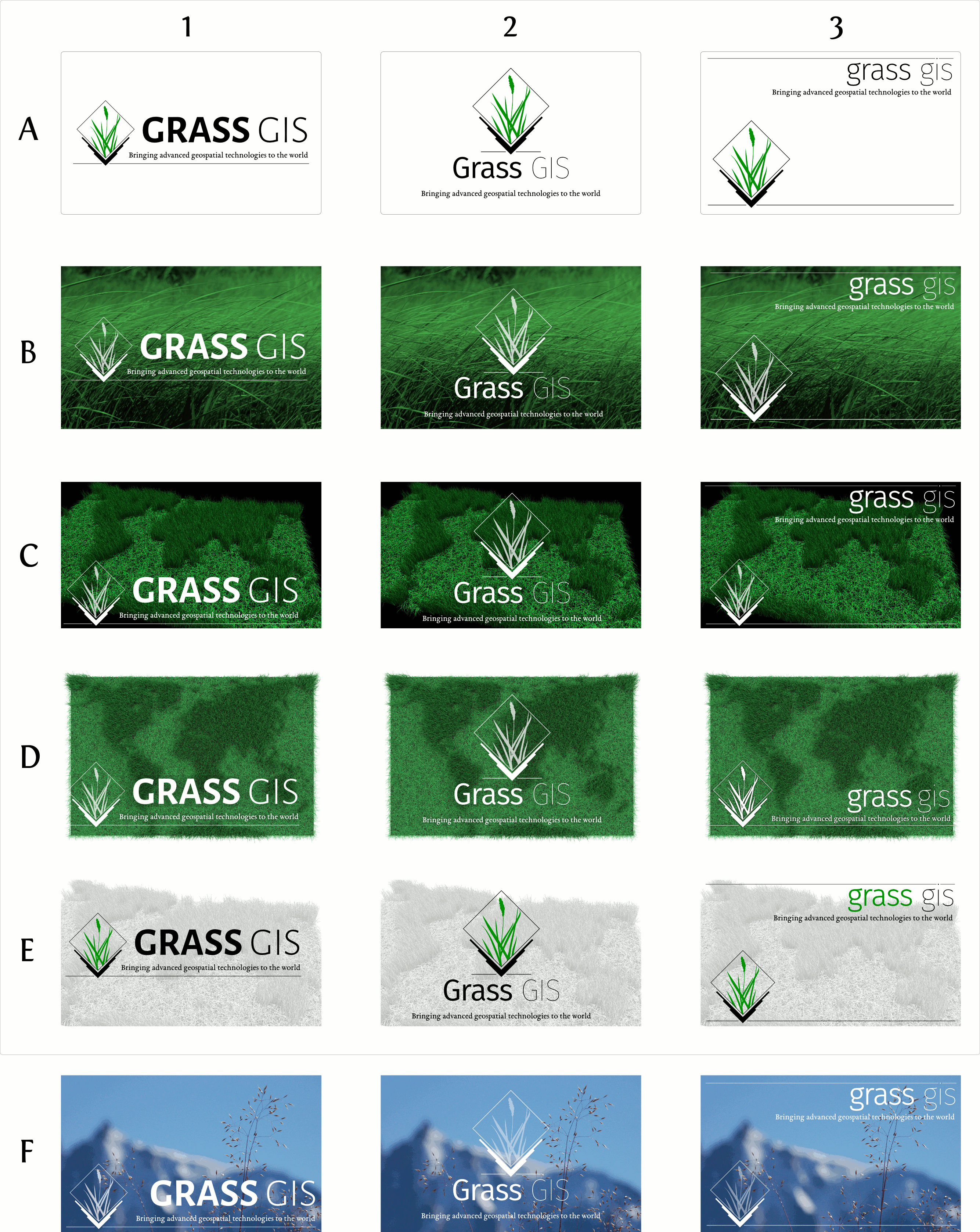
After several tests, we put things together in an array:
- col 1: capitalized title, fontface Alegreya Sans, text and tagline beside logotype;
- col 2: partially lowercased, fontface Fira  Sans, stacked centered layout;
- col 3: lowercase title, fontface Fira Sans, flushright/flushleft positioning.

- raw A: white background, potential thin black border;
- raw B: metaphoric background image (to be refined, potential restricted rights), white graphics+lettering;
- raw C: 3d composition showing a virtual grassy world map, white graphics+lettering;
- raw D: same sort of scene but in top view, on white or transparent background;
- raw E: grayscale grassy world, black and green graphics+lettering;
- raw F: personal image, less iconic than decorative in truth...
GRASS GIS Welcome banner
The welcome banner is the image displayed on top of the Welcome frame that pops up when launching GRASS. This image, if present, should be coherent with the graphic design, especially with the splash screen.
Proposals
The following three banners go respectively with columns 1, 2, 3 of the array above.

Given latest requests, here are three extra png banners:


GRASS GIS sticker
Objective
GRASS GIS users may need to display a short information about the use of the software in their projects. It might be useful to propose a normalized sticker for that.
Proposals
Usually these tags are composed with freehand lettering, we propose this sticker:
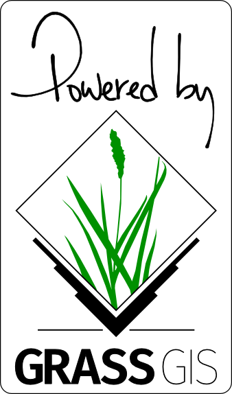
But one can prefer keeping close to the more sober identity and compose the slogan in garamond:
The following graphics could be used on map compositions:
Selected startup banner
On Feb 6, 2015 (commit r64480 the banner was uploaded to the source code. Related files: