User:NikosA: Difference between revisions
m (→Scratching ideas for the GRASS-wiki: Testing custom CSS in common.css page) |
m (Example of (Landsat) NDVI vs. EVI2) |
||
| Line 9: | Line 9: | ||
nik at nikosalexandris dot net | nik at nikosalexandris dot net | ||
== Map Swipe (g.gui.mapswipe) == | == Screenshots == | ||
=== EVI2 vs NDVI === | |||
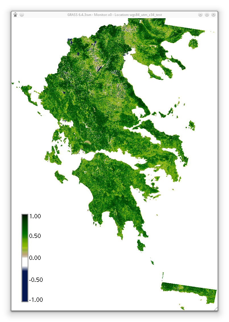
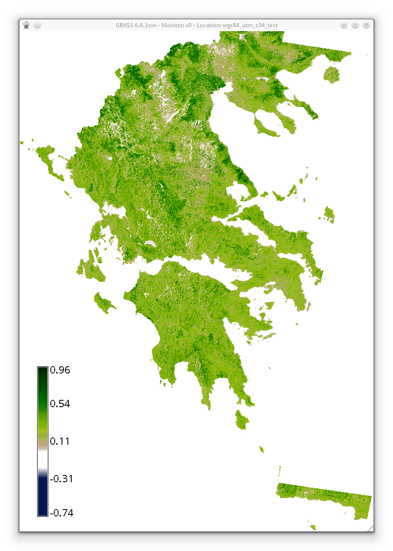
EVI2 vs. NDVI | |||
{| | |||
|[[File:ndvi_based_on_histomatched_summer_landsat_utm_z34n.png|thumb|400px|border|center|NDVI based on summer Landsat acquisitions (from 2009 to 2011, histomatched, only tiles that originally fall into UTM Z34N) covering Ellas (Greece)]] | |||
|[[File:evi2_based_on_histomatched_summer_landsat_utm_z34n.png|thumb|400px|border|center|EVI2 based on summer Landsat acquisitions (from 2009 to 2011, histomatched, only tiles that originally fall into UTM Z34N) covering Ellas (Greece)]] | |||
|} | |||
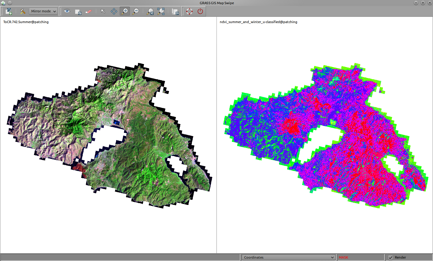
=== Map Swipe (g.gui.mapswipe) === | |||
Recent addition in GRASS 70: http://grasswiki.osgeo.org/wiki/WxGUI_Map_Swipe | Recent addition in GRASS 70: http://grasswiki.osgeo.org/wiki/WxGUI_Map_Swipe | ||
Revision as of 08:49, 4 May 2013
Nikos Alexandris
Other userpages
Contact
nik at nikosalexandris dot net
Screenshots
EVI2 vs NDVI
EVI2 vs. NDVI
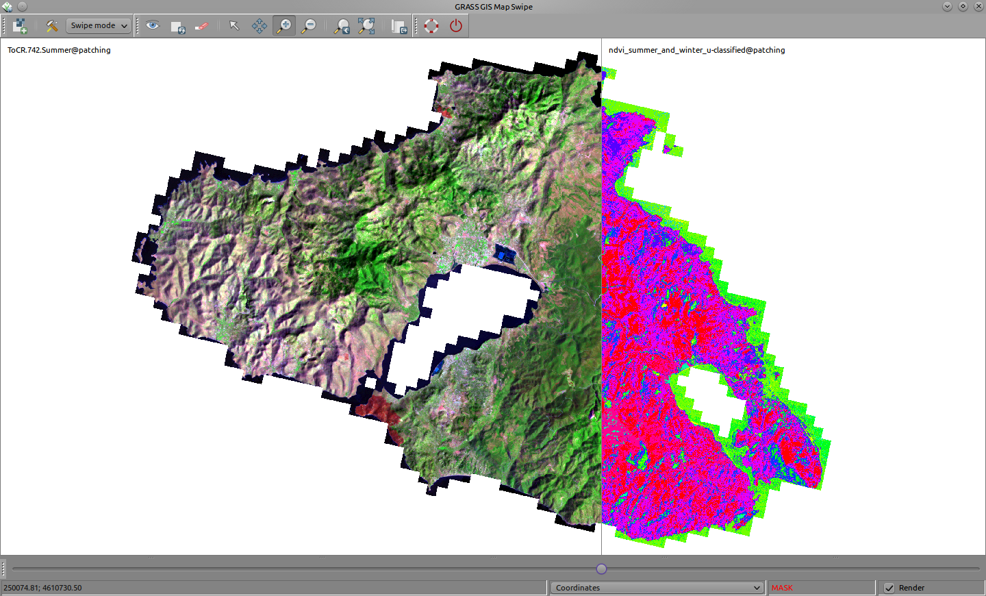
Map Swipe (g.gui.mapswipe)
Recent addition in GRASS 70: http://grasswiki.osgeo.org/wiki/WxGUI_Map_Swipe
Scratching ideas for the GRASS-wiki
Various ideas discussed with <http://archi.tect.gr/>
Testing on http://grasswiki.osgeo.org/wiki/User:NikosA/common.css
GRASS-Wiki content maintainance
Various issues
To list...
Upon the use of Templates =
True, content is the foremost essence. In order to ease off content reviewing and management, WikiMedia, upon which the GRASS-Wiki relies, has the Special Pages section. Still, there is a significant need for user input to control the content. Towards a better and easier maintainance mechanism, it might be useful to setup as much as possible Templates which can be used easily across the entire GRASS-Wiki to mark pages and notify readers.
For example, it is not always easy to discriminate between truely OutDated content or simply content that refers to an older version of GRASS. In this case, a notification indicating that the content refers to an older version of GRASS (be it GRASS 5.x) would be, perhaps, a smarter solution than simly marking the page as old. Alternatively, or in addition to a Template, a corresponding Category should be created.
There is, in my opinion, a natural need for some concrete, short, useful set of basic Templates. There are already several Templates. However, the influence in organising the content will be more effective, if the Templates adhere to a basic set of universal rules (think of appearance that invites to get involved) and delivers in a concrete way the "message" (think of short, rational, meaningful notification and/or explanations).
Towards this scope, I support the creation and collection of Templates to cover, if not all, at least the very basic needs to help tag the content.
GRASS-Wiki styling
- style the tab-bar to approach the grass-gis website?
Ideas for an alternative GRASS-Wiki logogram
 |
 |
 |
 |
GRASS-Wiki native colors
Should GRASS-Wiki pages wear GRASS' native colors?
Or else... ?
Some random example: light grey font-color (#dcdcdc), green border (#4da948)
Better typography
Review and possibly alter:
- linespacing (between hierarchy elements!)
- indentation of code blocks -- might improve readability
- (non-code) text wrapping -- narrower body text column, easier to read
- move ToC on the right, make it fixed! This will "save" some long pages!
- move Categories right below the ToC -- also useful inside long pages
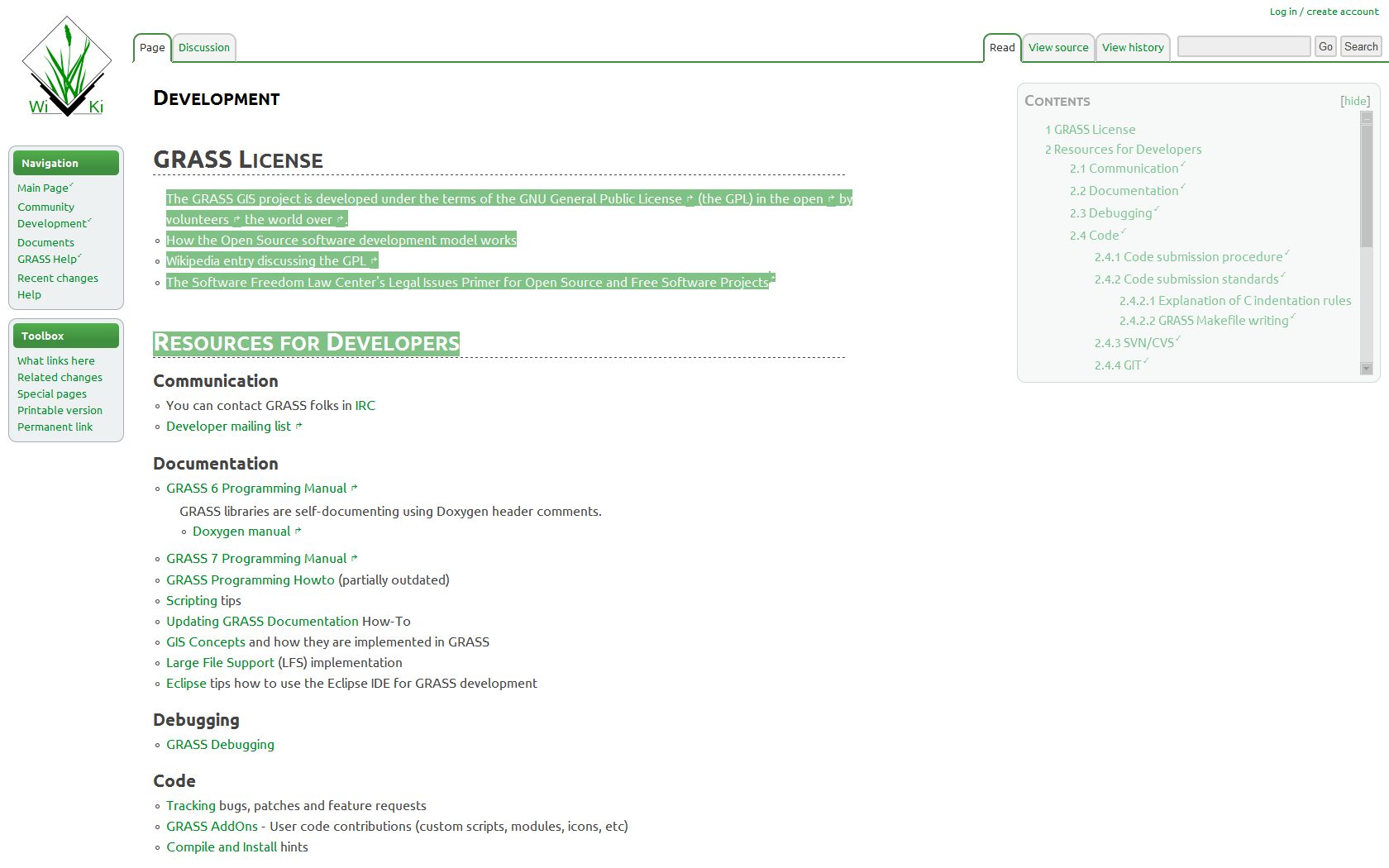
Some proof-of-clean-typography screenshots
First impressions of a custom css designed by <http://archi.tect.gr/>
Holistic Look & Feel
GRASS-Wiki, better typography!
Elements
The very left column is like a Wiki's connection terminal -- it should look and act like that for the user. It should also clearly state GRASS-GIS' identity.
 |
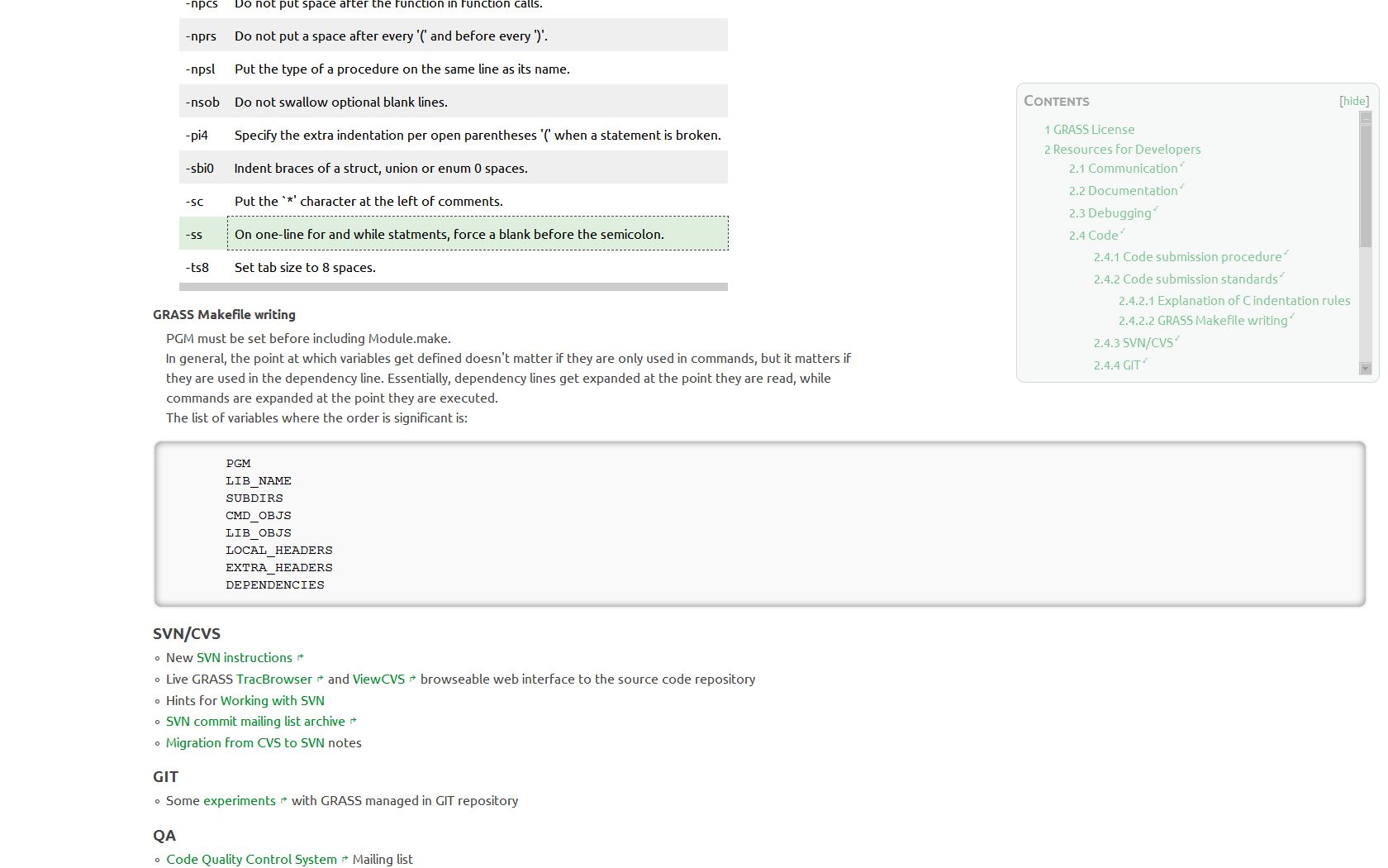
Better typography is not only about aesthetics. It's about readability and making things easier to study. The screenshot below speaks for itself. Hint: the ToC is always accessible, following the user's eyes!
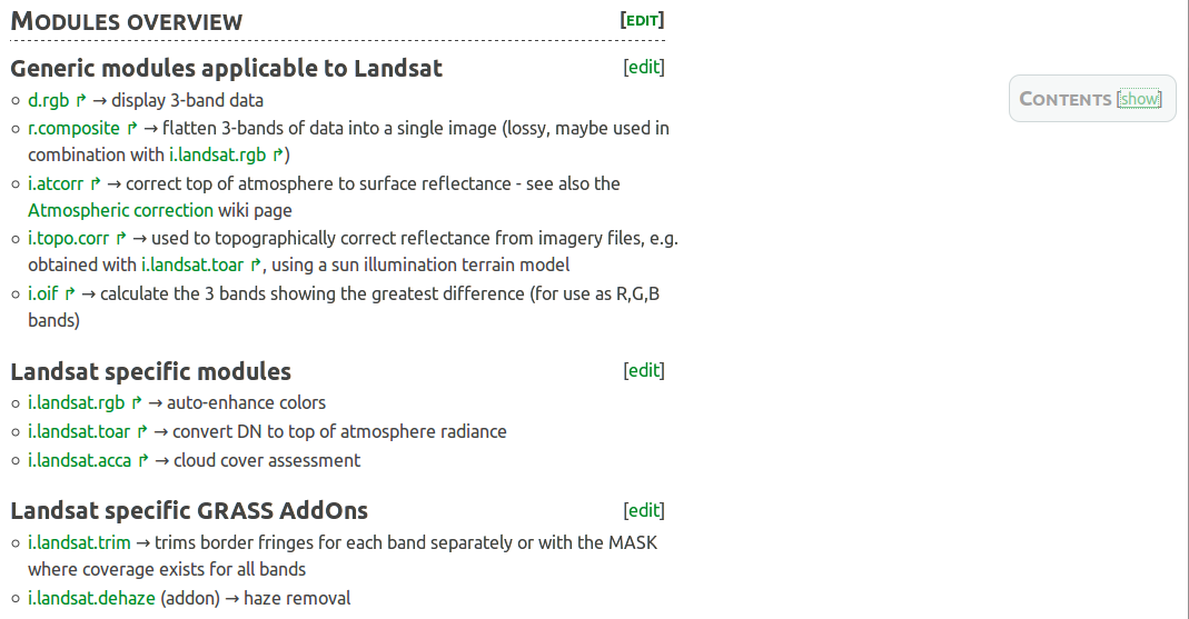
The Table of Contents is a must have for page-content organisation and navigation. Can it be *always* accessible while not distracting the user from reading when not required? Yes, it can.
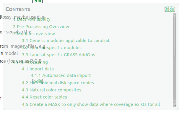 |
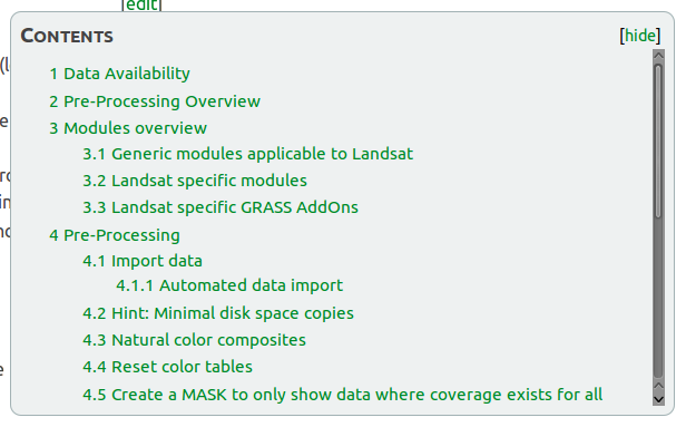 |
The Categories bar, finally can receive the attention it deserves!

Related sources:
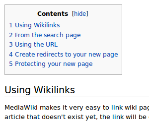
Distance between ToC and 1st Section
Match Media-Wiki's bigger distance from ToC to 1st Section!
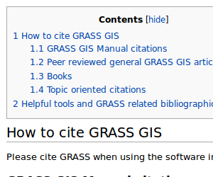 |
 |
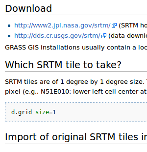
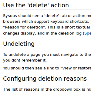
Distance between Sections
Seems to be the same, for some reason, anyhow, some lengthy GRASS-pages look overfilled/noisy!
 |
 |
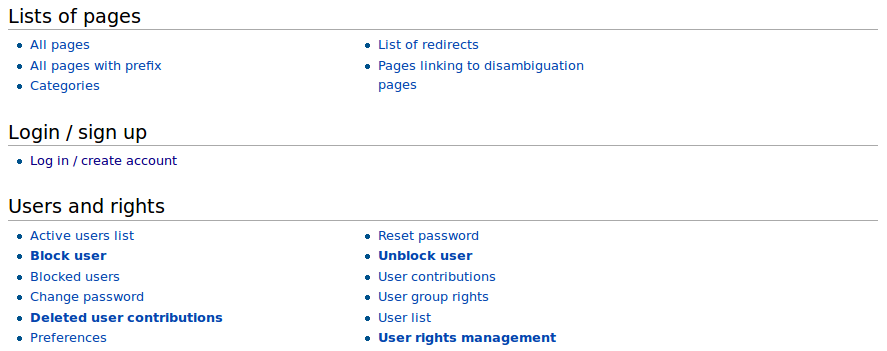
The GRASS-Wiki Special Pages are nicely structured, easy to read. Is there, and what exactly, a formatting difference with the "dafault" GRASS-Wiki pages?
